Understanding Stock Charts: A Guide for Beginners
In stock trading, charts are not just pretty colors, lines, and bars but rather an essential aid to help the trader/investor stay on course. So, let's take a close look at what charts are, how they work, and what type one is likely to encounter.
What is a Chart?
In its most basic form, a chart represents the above as a visual of the stock's price movement over time. It gives an indication of where the price has been and where it has moved within given time frames, whether that be an hour, day, week, month, or even years.
Charts usually have two axes: the horizontal axis, or x-axis, and the vertical axis, or y-axis. The x-axis is normally a representation of time, while the y-axis is the price. When we plot the price of a stock on these two axes, a vivid picture of its trading history is delineated. In addition to this, charts can be used to depict trading volume, which is a measure of how many shares have exchanged owners during a given timeframe.
Types of Price Charts: -
There is more than one way to project the stock prices, and each projection offers its own unique style. So, let's see the three most common types of them:
1. Line Charts:
Line charts are simple yet powerful. They are formed by connecting the closing prices of a stock over a certain period. This technique gives a much more correct idea about the trend of the price of the stock and allows the traders to grasp the general direction of the market. Line charts are very effective in identifying trends and giving an overall broader perspective.
2. Bar Charts:
Bar charts are somewhat detailed. These are graphs that show the history of an action of prices over a certain period of time, recording the high, low, opening, and closing prices. The price range, on each bar of the chart, is represented by a vertical line, while small horizontal lines at both ends represent the opening and closing prices. They are versatile; it's possible to make bar charts for many different time frames - from minutes up to months. That's one of the main reasons so many traders favor using them when they need more insight into the details of price action
3. Candlestick Charts:
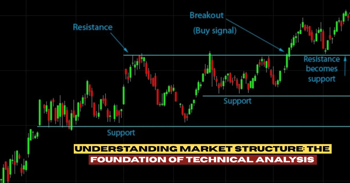
The Candlestick Charts draw a vivid picture of the market dynamics. Every candlestick graphically represents the open, high, low, and closing prices for a selected period using a two-dimensional body and "shadows" (lines extending above and below the body). The body represents the range between opening and closing prices, while the shadows show high and low prices of the period.
Above all, candlestick charts are valued for their capability to show market sentiment and psychological influences. They paint a picture of trading activity that can be used to detect patterns, which more often than not indicate the continuation or termination of a trend. Japanese traders have used candlestick patterns for centuries as the only basis on which to make short-term trading decisions, and their techniques have become an integral part of technical analysis.
Why Candlestick Charts?
What, then, is so different about candlestick charts from traditional bar charts? The candlesticks give a deeper feel for price action. Instead of just marking the high and low with ticks on a line, the candlesticks paint a picture of the range between the open and close prices. This not only lets an analyst understand how a stock's price has moved, but also how the trader's sentiment might have shifted during the period.
Japanese traders have used candlestick charts for many years to represent the action of markets and to point out important patterns. These patterns give great insight into the trend of the market and can help the trader make confident decisions on buying, selling, and holding onto the investment.
Conclusion:
Whether you are a complete beginner with stock trading or looking to improve your analytical skills, learning how to read and interpret various chart types is important. Line charts, bar charts, and candlestick charts all bring their special perspective into the market activity that will help you make more informed decisions. You will be much better prepared to navigate the complexities of the stock market and to make informed investment decisions once you are more familiar with these tools. Happy charting!


